5 Portfolio Websites That Feel Like Complete Experiences
Five memorable portfolios that use personality, storytelling and navigation to make the work—and the person behind it—hard to forget.
Most portfolios are clean.
Very few are memorable.
A polished layout, a project grid, an About section and a contact button can make a website look professional. But when every portfolio follows the same formula, the person behind the work becomes difficult to remember.
A strong portfolio should do more than display finished projects.
It should reveal:
- how you think,
- what you care about,
- how you make decisions,
- and why your work feels different.
I explored five portfolio websites that approach this problem in completely different ways.
Some are playful.
Some are highly structured.
Some turn navigation into part of the story.
The goal is not to copy their animations, colours or layouts.
The goal is to understand why their choices work—and apply those principles to your own portfolio.
1. Timothy Ogundipe — Build a world, not just a project grid
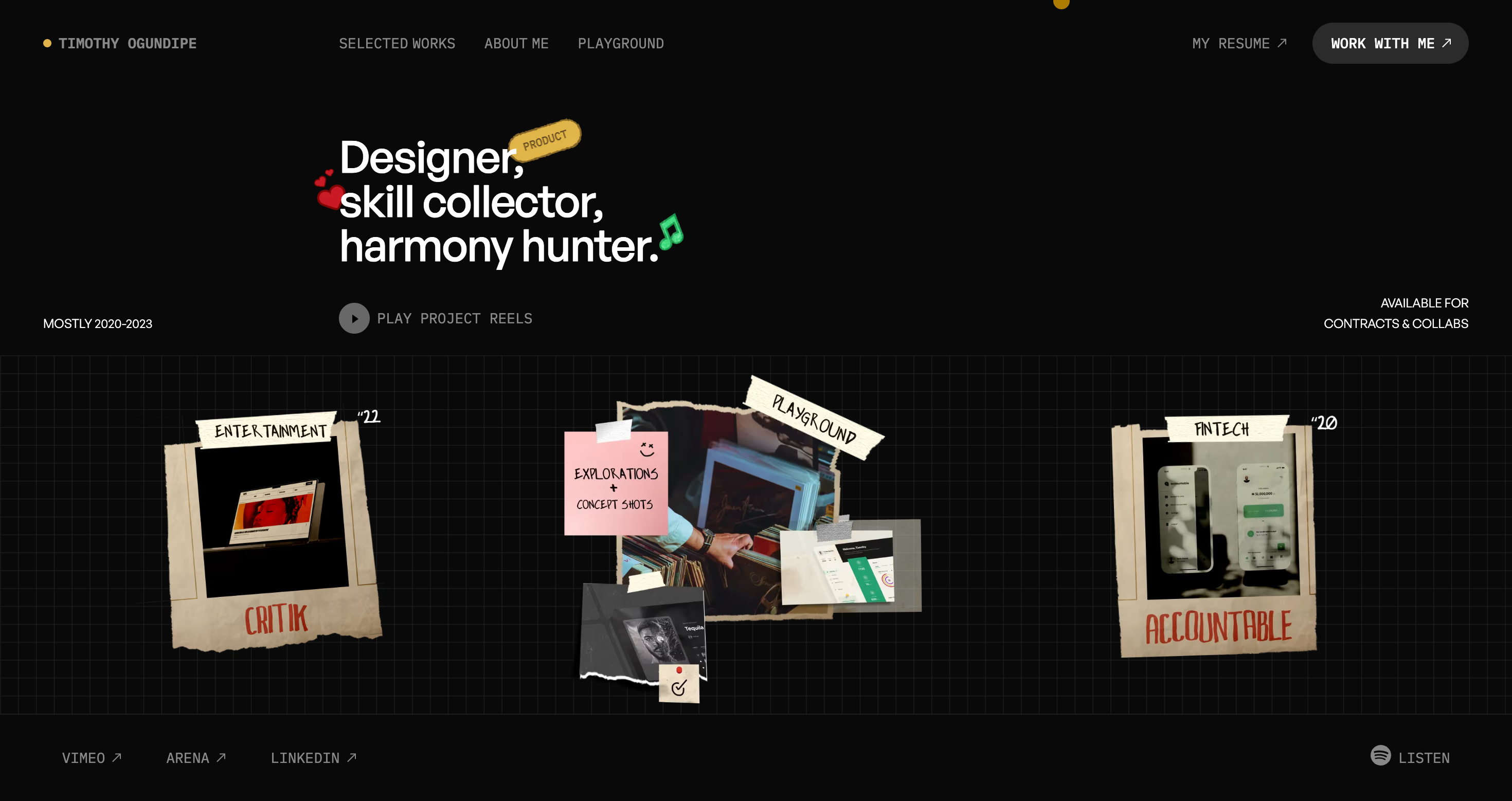
Explore Timothy Ogundipe’s portfolio
Timothy Ogundipe’s portfolio feels more like a creative playground than a conventional résumé website.
The collage-style layout, project reels, expressive labels and experimental sections immediately create a strong visual identity. Before opening a single case study, you already understand something about the person behind the work.
That is the difference between simply showing projects and creating a memorable experience.
Why it works
- The visual style feels consistent across the entire website.
- The copy sounds personal rather than corporate.
- The project previews make the work easy to sample.
- The playground reveals curiosity beyond polished client work.
The takeaway:
Show people how you think before asking them to read a long case study.
Your portfolio does not need to hide every unfinished experiment or strange idea. Small explorations can reveal your taste, curiosity and creative direction.
Try this in your own portfolio
Add one small section that shows:
- experiments,
- unfinished ideas,
- UI explorations,
- side projects,
- or things you are currently learning.
You do not need twenty polished projects.
A few carefully selected pieces with a clear personality are stronger than a large, forgettable gallery.
2. Jackie Hu — Let interactions express personality
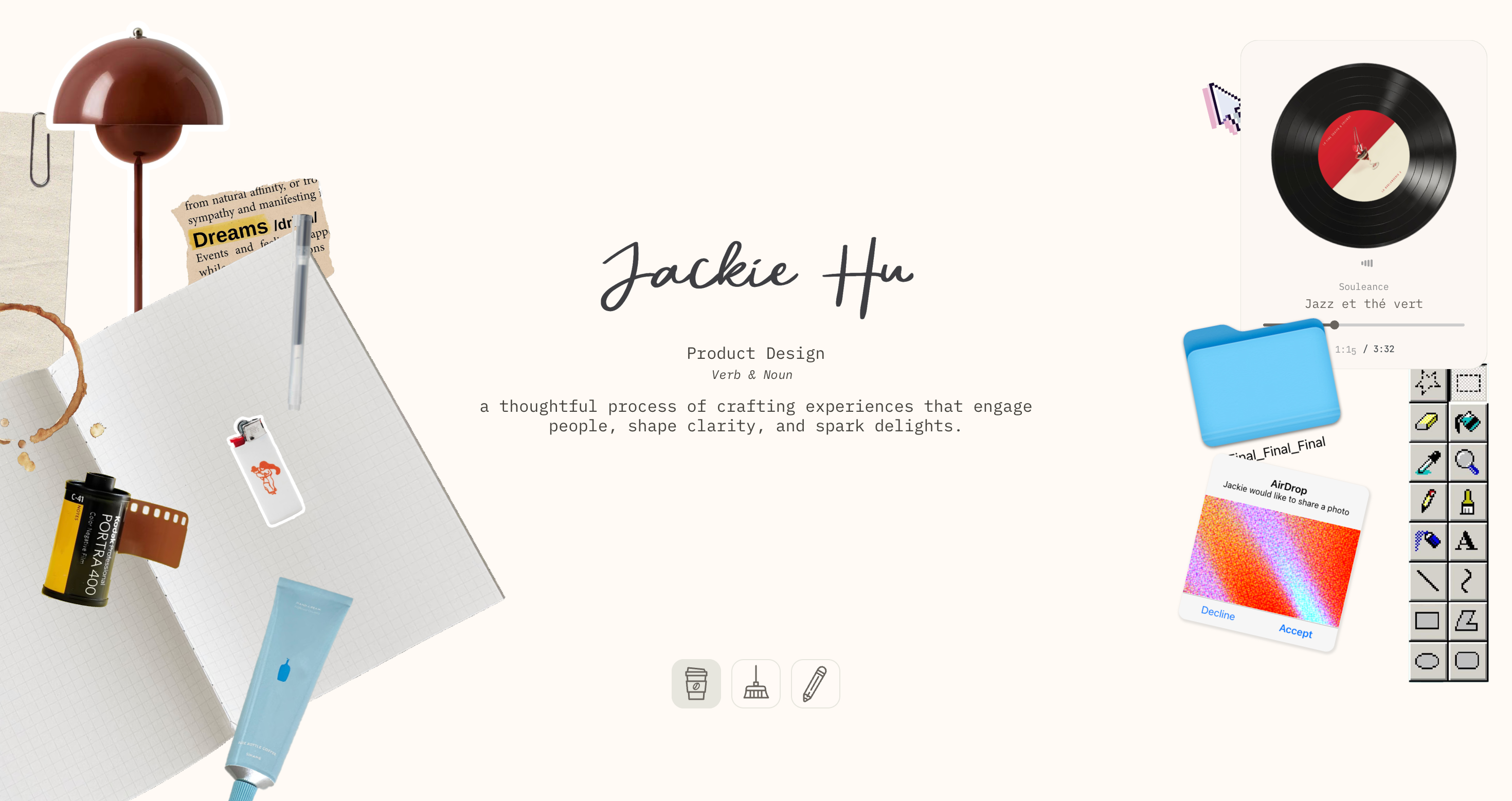
Jackie Hu uses familiar digital interactions in unexpected ways.
Music controls, AirDrop-inspired elements, playful messages and conversational copy make the website feel personal from the first screen.
The experience is expressive, but the actual design work remains accessible.
That balance matters.
A creative portfolio becomes frustrating when visitors cannot find the projects, understand your role or reach the contact page. Jackie’s portfolio proves that personality and usability do not have to compete.
Why it works
- Familiar interface patterns are used as storytelling tools.
- Small interactions make the website feel human.
- The playful layer supports the work instead of hiding it.
- The tone feels personal without making the projects feel less serious.
The takeaway:
Personality does not need to live inside a separate About page.
It can appear in your:
- button labels,
- transitions,
- loading states,
- hover interactions,
- empty states,
- and microcopy.
Try this in your own portfolio
Replace one generic line such as:
View project
with something that sounds more like you:
See how I built it
or:
Open the full breakdown
One thoughtful interaction can communicate more personality than a long paragraph describing yourself.
3. Mackenzie Child — Make your experience easy to understand
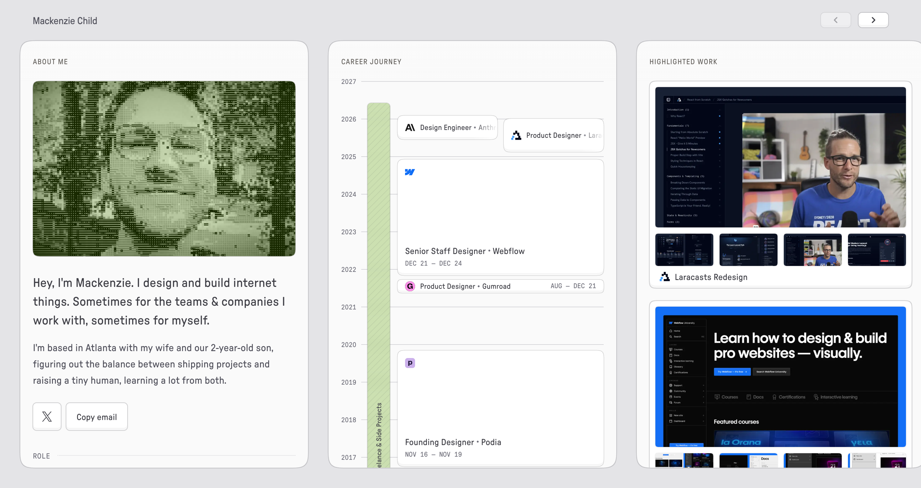
Explore Mackenzie Child’s portfolio
Mackenzie Child takes a more structured approach.
The portfolio presents the role, focus, tools, career history and highlighted projects inside one clear visual system.
Instead of making visitors jump between several pages, it allows them to understand a large part of Mackenzie’s professional story from a single view.
The career timeline is especially effective because it turns years of experience into something visual and easy to scan.
This portfolio proves that a memorable website does not always require complex animation.
Sometimes, clarity is the main design idea.
Why it works
- The information hierarchy is immediately understandable.
- Career history is presented visually.
- Project previews include enough context to create curiosity.
- The website feels personal without sacrificing readability.
The takeaway:
Do not make recruiters search for the information they need.
A visitor should quickly understand:
- What do you do?
- What kind of work have you done?
- What were you responsible for?
- Which tools do you use?
- How can someone contact you?
Try this in your own portfolio
Open your homepage and give yourself ten seconds.
Can you clearly identify:
- your role,
- your strongest skill,
- your best work,
- and your contact method?
If not, your portfolio may look good while still making the visitor work too hard.
Creativity earns attention.
Clarity turns that attention into opportunities.
4. Jackie Zhang — Show the beliefs behind your work
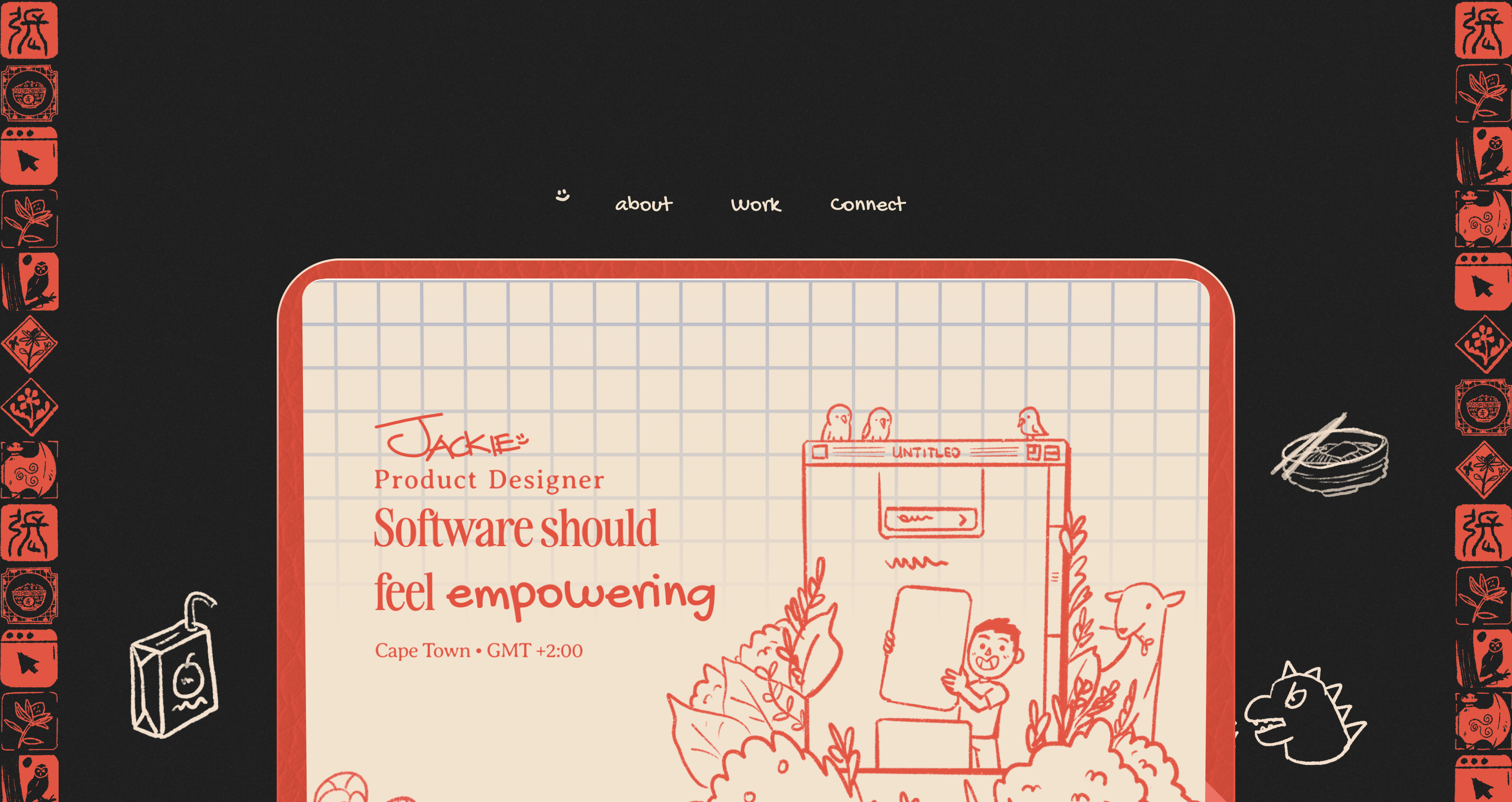
Explore Jackie Zhang’s portfolio
Jackie Zhang’s portfolio communicates a clear point of view: software should feel natural.
The website does not only present finished screens. It also explains the beliefs connecting the work—clarity, thoughtful interactions and products that help people feel capable.
That context changes how the projects are understood.
Instead of seeing several unrelated pieces, the visitor sees a consistent way of thinking.
Why it works
- A clear design philosophy appears early.
- The beliefs provide context for the selected work.
- The typography and spacing feel confident.
- The portfolio explains the thinking behind the output.
The takeaway:
Do not only show what you designed. Show what you believe good design should do.
Your belief does not need to sound dramatic or philosophical.
It only needs to be honest and specific.
For example:
I believe developer tools should explain what went wrong instead of forcing users to search through vague errors.
That sentence instantly gives someone a better understanding of how you approach product decisions.
Try this in your own portfolio
Write one sentence that begins with:
I believe good software should...
Then ask yourself whether your projects support that statement.
A clear point of view helps separate your portfolio from a collection of unrelated screens.
5. Yuki Asakura — Make the format reflect the work
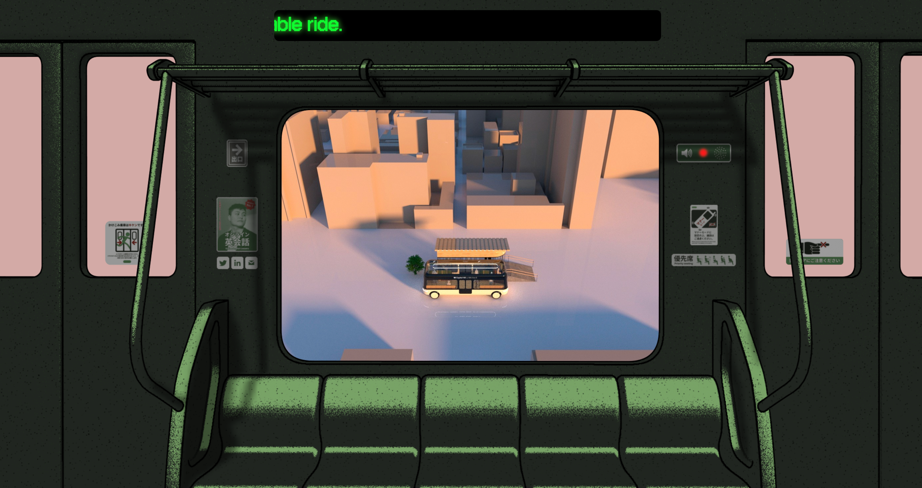
Explore Yuki Asakura’s portfolio
Yuki Asakura works on cities and mobility, and the portfolio turns that focus into the experience itself.
Instead of presenting projects through a normal card grid, the website invites visitors to begin a journey.
The visual world feels connected to transport, movement and place.
This is not decoration added after the content was finished.
The format reinforces the type of work Yuki cares about.
Why it works
- The concept is directly connected to the designer’s field.
- Navigation becomes part of the story.
- The experience creates a strong sense of movement.
- The website is difficult to confuse with another portfolio.
The takeaway:
The format of your portfolio can reflect the problems you care about.
A motion designer might make movement central to the experience.
A developer interested in accessibility might build accessibility controls into the site itself.
A data designer might turn their career history into an interactive dataset.
Try this in your own portfolio
Ask:
Is there a small way my portfolio experience could reflect the type of work I want to be hired for?
You do not need to build an entire virtual world.
Even one meaningful interaction can connect your identity to your work.
What all five portfolios have in common
These websites look completely different, but they share one deeper principle:
The design begins with a point of view.
They do not start with:
Which animation should I add?
They start with:
What should someone remember about me after closing this website?
The answer then shapes the:
- layout,
- typography,
- copy,
- navigation,
- transitions,
- and project presentation.
Here is the central lesson from each portfolio:
| Portfolio | Principle worth borrowing |
|---|---|
| Timothy Ogundipe | Treat your portfolio as a creative world |
| Jackie Hu | Use small interactions to express personality |
| Mackenzie Child | Make professional experience easy to scan |
| Jackie Zhang | Show the beliefs behind your work |
| Yuki Asakura | Let the experience reflect your field |
Do not copy the surface
It is tempting to discover a memorable portfolio and immediately copy its:
- dark theme,
- cursor effect,
- collage layout,
- animations,
- or unusual navigation.
That usually creates a weaker version of the original.
Instead, ask why the decision works.
Do not copy a transport-inspired interface only because it looks impressive.
Ask what part of your own work could shape your portfolio experience.
Do not add music because another designer did.
Ask which small interaction could communicate your personality.
Do not build a complex career timeline when two clear projects would explain your experience better.
Steal the principle, not the appearance.
Before redesigning your portfolio, answer these questions
1. What opportunity should this portfolio attract?
A freelance client, startup founder and engineering recruiter will look for different signals.
Design for the opportunity you actually want.
2. What should someone understand within ten seconds?
Your role and strongest value should not be hidden behind an animation or vague headline.
3. What should they remember after leaving?
Not your background colour.
Not the animation library you used.
What should they remember about you?
4. Which projects provide the strongest evidence?
You do not need to display everything you have ever built.
Choose the work that best supports the role you want next.
5. What part of your personality belongs in the experience?
This could appear through:
- writing,
- visual taste,
- humour,
- motion,
- experiments,
- or the way you explain decisions.
6. Is every creative choice helping the visitor?
A portfolio is not only a creative exercise.
It is also a communication tool.
If an interaction looks impressive but makes your work harder to understand, it is probably working against you.
A practical formula for a memorable portfolio
You do not need a massive redesign.
Start with this simple structure:
Clear positioning
Explain who you are and what you do in one sentence.
Strong proof
Show two or three projects with clear responsibilities, challenges and outcomes.
Personal point of view
Reveal what you care about and how you approach decisions.
Thoughtful details
Use copy, interaction and visual choices to make the experience feel like yours.
Easy next step
Make it obvious how someone can contact, hire or learn more about you.
Final thought
Most portfolios are not forgettable because they lack animation.
They are forgettable because they do not communicate a clear point of view.
Before changing your colours, adding another interaction or rebuilding your homepage, decide what you want someone to remember.
Then design everything else around that answer.